Coverage Visualizations
Understand different visualization types and how to interpret them for optimal network planning.
Signal Strength
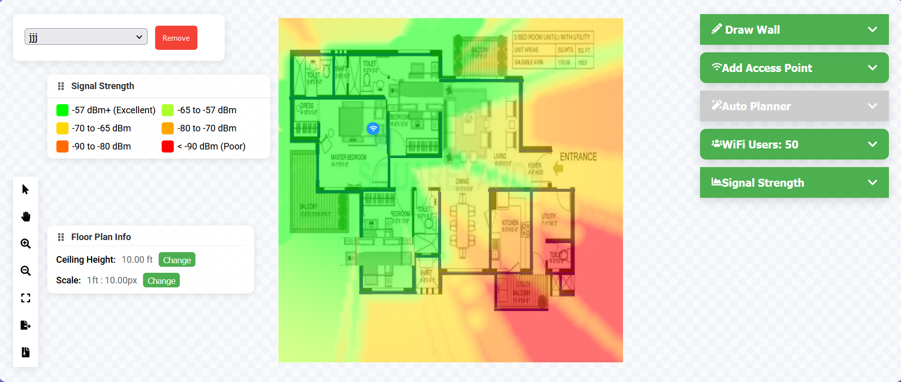
Color Scale
- Dark Green (-57 dBm or better): Excellent
- Light Green (-65 to -57 dBm): Very Good
- Yellow (-70 to -65 dBm): Good
- Orange (-80 to -70 dBm): Fair
- Red (below -80 dBm): Poor
Interpretation
- -67 dBm: Minimum for voice
- -70 dBm: Minimum for data
- -80 dBm: Minimum for basic connectivity
Data Rate
Premium Feature
Data rate visualization is available with Premium subscription.
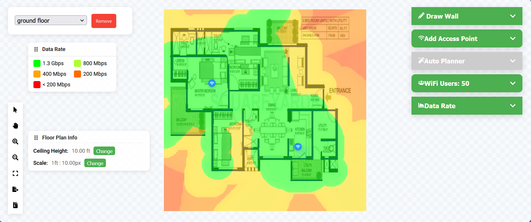
Color Scale
- Dark Green: 1.3+ Gbps
- Light Green: 800 Mbps - 1.3 Gbps
- Yellow: 400-800 Mbps
- Orange: 200-400 Mbps
- Red: Below 200 Mbps
Factors Affecting Data Rate
- Signal strength
- Channel width
- MIMO configuration
- Client capabilities
Signal-to-Noise Ratio (SNR)
Premium Feature
SNR visualization is available with Premium subscription.
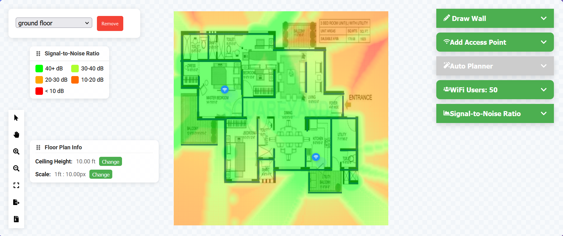
Color Scale
- Dark Green: 40+ dB (Excellent)
- Light Green: 30-40 dB (Very Good)
- Yellow: 20-30 dB (Good)
- Orange: 10-20 dB (Fair)
- Red: Below 10 dB (Poor)
Minimum Requirements
- 25 dB: Voice and video
- 20 dB: Data applications
- 15 dB: Basic connectivity
Channel Overlap
Premium Feature
Channel overlap visualization is available with Premium subscription.
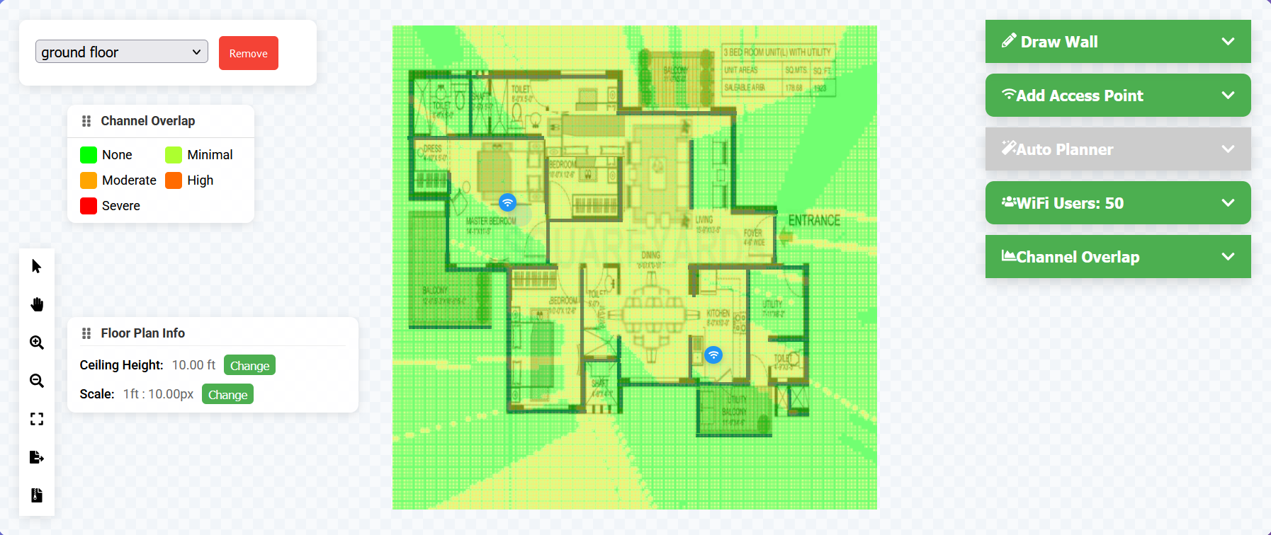
Color Scale
- Green: No overlap
- Yellow: Minimal overlap
- Orange: Moderate overlap
- Red: Severe overlap
Best Practices
- Use non-overlapping channels
- Maintain channel separation
- Consider co-channel interference
- Plan for frequency reuse
Client Capacity
Premium Feature
Capacity visualization is available with Premium subscription.
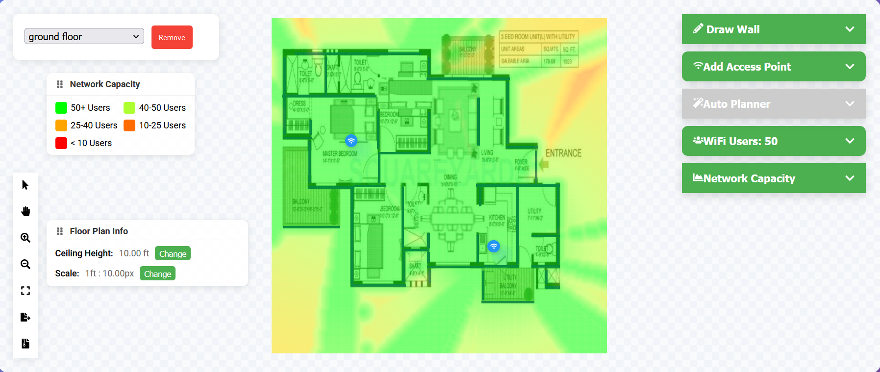
Color Scale
- Dark Green: 50+ clients
- Light Green: 40-50 clients
- Yellow: 25-40 clients
- Orange: 10-25 clients
- Red: Below 10 clients
Capacity Factors
- Signal quality
- Channel utilization
- AP capabilities
- Client density
Pro Tip
Use multiple visualization types together to ensure comprehensive coverage and optimal performance. For example, check both signal strength and SNR to identify areas that might have strong but noisy signals.